
Some Data Viz
Stack Overflow’s annual Developer Survey is the largest and most comprehensive survey of people who code around the world.The survey delves into various aspects of the developer landscape, offering insights into programming languages, tools, job satisfaction, and industry trends.Insights are collected on programming languages, frameworks, development methodologies, and emerging trends.Cognos Dashboard Embedded is a dynamic visualization tool that enables the creation of interactive and visually engaging dashboards.The primary objective is to harness the valuable insights from the Stack Overflow survey using CDE to provide organizations /readers with a consolidated view of developer preferences.The integration of survey data into Cognos Dashboard Embedded equips decision-makers with actionable insights for strategic planning.
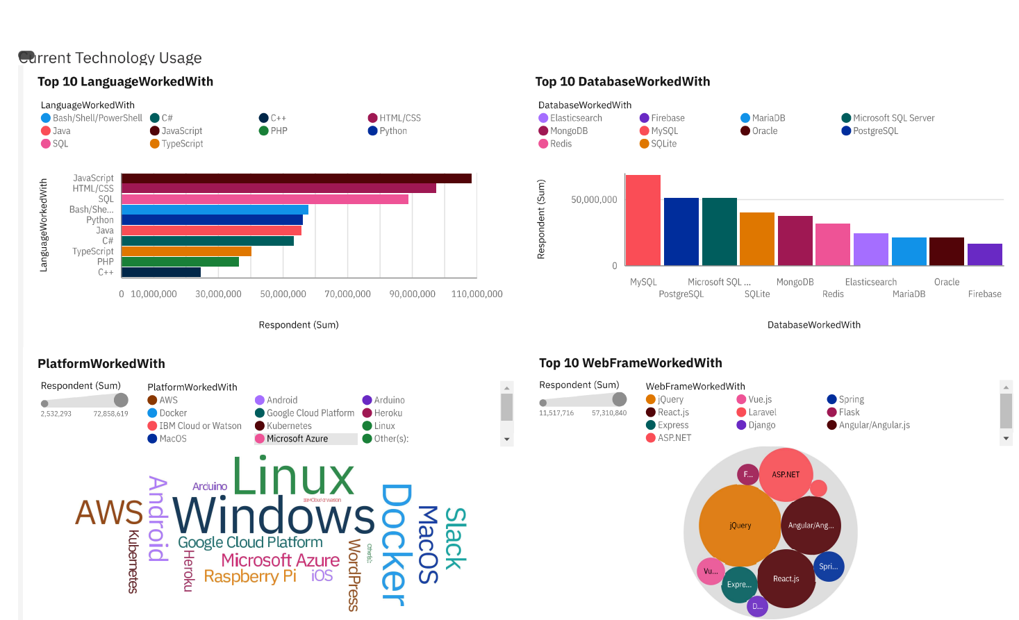
Figure 1. In this Tableau project, the first panel focuses on capturing and visualizing the top 10 programming languages worked with, using a bar chart with bars, length, and color attributes, along with value labels and an appropriately titled chart. The second panel replicates this approach for the top 10 databases, utilizing a column chart. The third panel employs a word cloud chart to illustrate the distribution of platforms worked with, emphasizing words, size, and color. Lastly, the fourth panel showcases the top 10 web frameworks through a hierarchy bubble chart, utilizing bubbles, size, and color fields, accompanied by a fitting chart title. Each visualization is meticulously configured to convey relevant insights in a clear and informative manner.
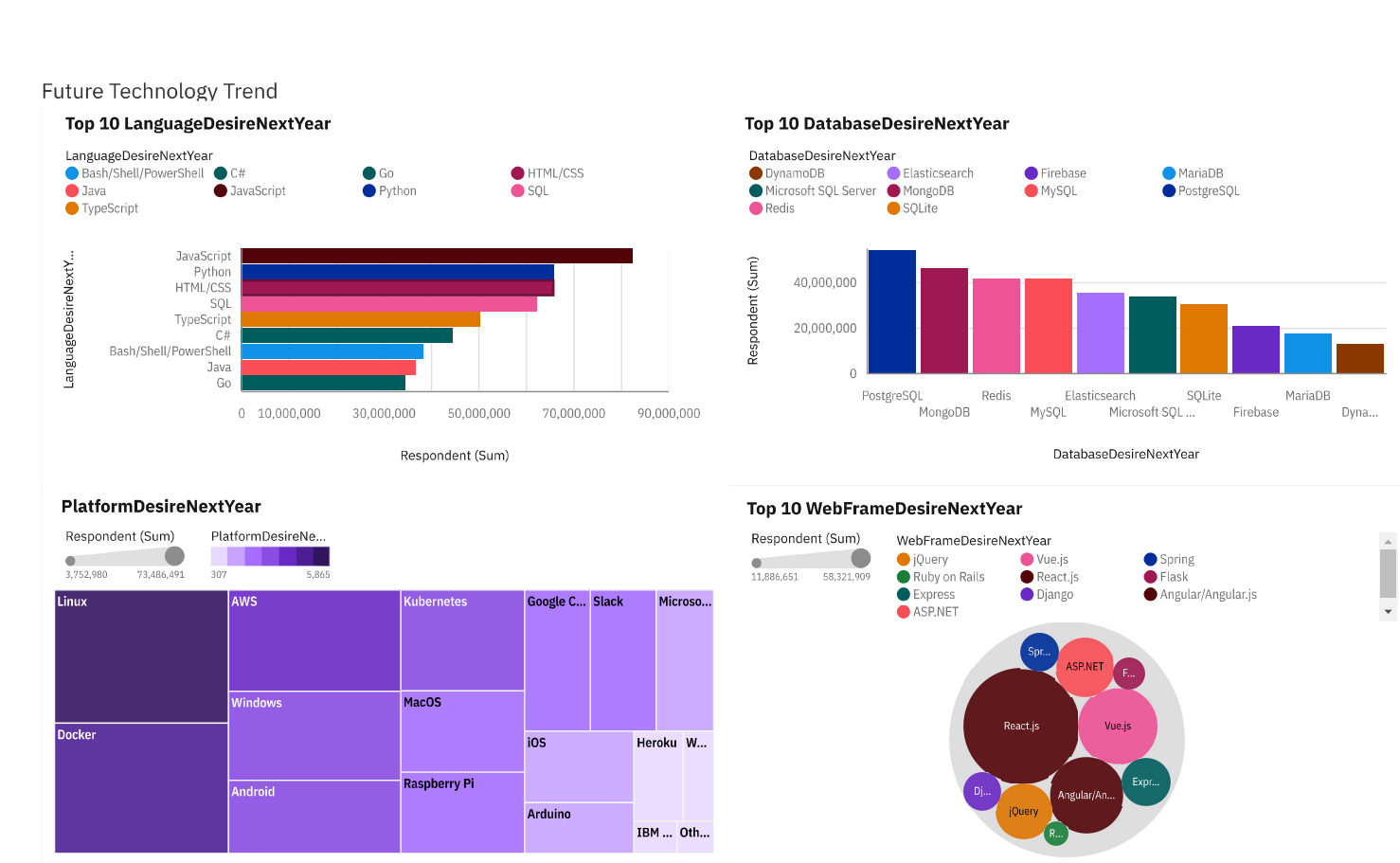
Figure 2: This Tableau project encompasses four panels, each spotlighting desired technologies for the next year. The first two panels feature bar and column charts, respectively, visualizing the top 10 desired programming languages and databases. The third panel utilizes a tree map chart for desired platforms, incorporating area hierarchy and heat fields. The fourth panel employs a hierarchy bubble chart for the top 10 desired web frameworks. Each visualization is meticulously designed with relevant attributes and titles to convey insights succinct.
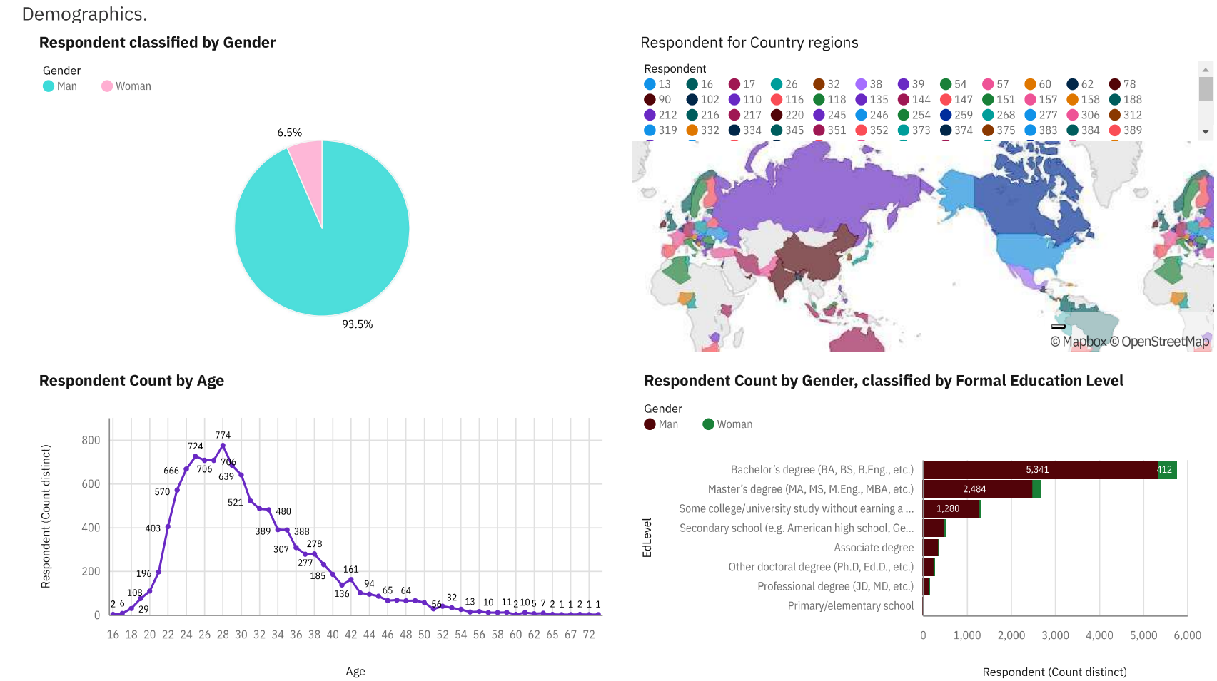
Figure 3: In the Demographics dashboard tab using m5_survey_data_demographics.csv, specific metrics are visualized with a focus on gender, countries, age, and education level. The Gender filter is applied, including only entries categorized as Man and Woman. Panel 1 presents a pie chart for respondents classified by gender, while Panel 2 showcases a map chart for respondent counts by countries. Panel 3 utilizes a line chart for respondent counts by age, and Panel 4 employs a stacked bar chart for respondent counts by gender, classified by formal education level. These visualizations provide a concise snapshot of demographic insights with targeted filters and key metrics.